
Kabutomaru & Tobi
4 posters
Page 1 of 1


G man- Uchiha Sasuke

 Health : 6
Country :
Posts : 2577
Registration date : 2009-08-07
Re: Kabutomaru & Tobi
![]() by Hiei March 25th 2012, 4:41 pm
by Hiei March 25th 2012, 4:41 pm
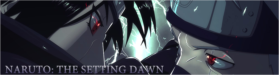
The render selection is great this time . High quality renders . Text is bad . A small suggestion just keep text smaller , simpler , plain and straight for starters . Choose higher quality stock and this sig will look much better . Add some efx as well amd try to get a flow .

Hiei- Hokage

- Health : 445
Country :
Posts : 10585
Registration date : 2009-08-01
G man- Uchiha Sasuke
- Health : 6
Country :
Posts : 2577
Registration date : 2009-08-07
Re: Kabutomaru & Tobi
![]() by Hiei March 25th 2012, 4:51 pm
by Hiei March 25th 2012, 4:51 pm
You see the shiny things in my signature ? They are one kind of effects . Flow means giving ur sig a direction . If you observe my sig ull see the efx and all move in one direction .
Hiei- Hokage
- Health : 445
Country :
Posts : 10585
Registration date : 2009-08-01
Re: Kabutomaru & Tobi
![]() by Norc March 25th 2012, 6:21 pm
by Norc March 25th 2012, 6:21 pm
You keep doing the same thing.Try to do something different.

Norc- Leviathan (Invidia)
")
- Health : 34
Country :
Posts : 984
Registration date : 2010-07-23
Re: Kabutomaru & Tobi
![]() by G man March 25th 2012, 6:23 pm
by G man March 25th 2012, 6:23 pm
Norc wrote:You keep doing the same thing.Try to do something different.
Only now I learned new things such as flow and efx, I will do different things now, and I hope I'll get better at this!
G man- Uchiha Sasuke
- Health : 6
Country :
Posts : 2577
Registration date : 2009-08-07
Re: Kabutomaru & Tobi
![]() by Guest March 25th 2012, 6:58 pm
by Guest March 25th 2012, 6:58 pm
Bad quality
Bad Text placement
Text not properly visible
Don't use much Texture(it looks like you did a lot...)
Disappointed with the render placement
Render is low quality too
hard to recognize what the render is
The black effect at the right side is the biggest negative point
Nothing much special in the sig
Try adding Abstracts or C4ds or something else
It's also having the same color everywhere
Try using Gradient map
Other than that, nice try.
Guest- Guest
Re: Kabutomaru & Tobi
![]() by G man March 25th 2012, 7:26 pm
by G man March 25th 2012, 7:26 pm
That sounds familiar for some reasonMr.Alucard wrote:Bad quality
Bad Text placement
Text not properly visible
Don't use much Texture(it looks like you did a lot...)
Disappointed with the render placement
Render is low quality too
hard to recognize what the render is
The black effect at the right side is the biggest negative point
Nothing much special in the sig
Try adding Abstracts or C4ds or something else
It's also having the same color everywhere
Try using Gradient map
Other than that, nice try.
Thanks anyway
G man- Uchiha Sasuke
- Health : 6
Country :
Posts : 2577
Registration date : 2009-08-07
Re: Kabutomaru & Tobi
![]() by Norc March 25th 2012, 7:32 pm
by Norc March 25th 2012, 7:32 pm
Render placement seems okay to me.I mean a render with a situation and pose like that placing them in the middle is just doesn't right.
Norc- Leviathan (Invidia)
- Health : 34
Country :
Posts : 984
Registration date : 2010-07-23
Re: Kabutomaru & Tobi
![]() by Phoenix March 25th 2012, 8:52 pm
by Phoenix March 25th 2012, 8:52 pm
95% of your posts have at least one emoticon in it. Bugs me.

Phoenix- Akatsuki Trainee

- Health : 30
Country :
Posts : 1578
Registration date : 2008-06-25
Re: Kabutomaru & Tobi
![]() by G man March 25th 2012, 9:06 pm
by G man March 25th 2012, 9:06 pm
Phoenix wrote:95% of your posts have at least one emoticon in it. Bugs me.
Sorry for being a happy guy dude. (No smiley, less happier post).
G man- Uchiha Sasuke
- Health : 6
Country :
Posts : 2577
Registration date : 2009-08-07
Re: Kabutomaru & Tobi
![]() by Hiei March 26th 2012, 5:53 am
by Hiei March 26th 2012, 5:53 am
I feel the render placement and quality are fine .
Hiei- Hokage
- Health : 445
Country :
Posts : 10585
Registration date : 2009-08-01
Re: Kabutomaru & Tobi
![]() by Guest March 26th 2012, 6:45 am
by Guest March 26th 2012, 6:45 am
In my opinion, render placement seems to be a bit odd but still, it's okay.
Guest- Guest
Page 1 of 1
Permissions in this forum:
You cannot reply to topics in this forum|
|
|