
latest signatures By Emiya24
+3
T.O.R.N.A.D.O
Hiei
emiya2424
7 posters
Page 1 of 1

latest signatures By Emiya24
![]() by emiya2424 October 20th 2012, 11:44 am
by emiya2424 October 20th 2012, 11:44 am
Sieghart

Shiki tohno
Arthuria(saber class)

Sebastian michaelis
Shiki tohno
Arthuria(saber class)
Sebastian michaelis

emiya2424- Chunnin of the Leaf

 Health : 9
Country :
Posts : 608
Registration date : 2011-10-08
Re: latest signatures By Emiya24
![]() by Hiei October 20th 2012, 11:45 am
by Hiei October 20th 2012, 11:45 am
Great improvement dude . You have become really good with gfx .
~KIU
~KIU

Hiei- Hokage

- Health : 445
Country :
Posts : 10585
Registration date : 2009-08-01

T.O.R.N.A.D.O
- Health : 42
Country :
Posts : 3512
Registration date : 2011-12-07
Re: latest signatures By Emiya24
![]() by emiya2424 October 20th 2012, 4:18 pm
by emiya2424 October 20th 2012, 4:18 pm
i actually stopped for a month... so i think my editing skills are a bit rusty
emiya2424- Chunnin of the Leaf
- Health : 9
Country :
Posts : 608
Registration date : 2011-10-08

iFlame975- Elite Artist Sai

- Health : 27
Country :
Posts : 2777
Registration date : 2010-10-23 -

Re: latest signatures By Emiya24
![]() by Bloodz! October 21st 2012, 2:14 am
by Bloodz! October 21st 2012, 2:14 am
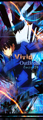
havnt seen your old stuff so cant tell if youve improved but you can still do a lot better mate ^^ nxt time try to hide the part where render is cut ( on the right part of the grand chase render ) like the border idea
could use better color selections and try to slap sum sh't on top of the render to help with the blending haha not really the corect way to blend but you can just start but actualy puting sum layers on top of the render
the 2nd signature looks a bit messy xD compose it a bit more nxt time, like bacground (blur), mid ground, foreground (sharpen) start with the basics
other than that looks pretty neet, keep it up man ^^

Bloodz!- Jounin of the Leaf

- Health : 70
Country :
Posts : 2784
Registration date : 2009-03-17
Re: latest signatures By Emiya24
![]() by chikido_rugi October 21st 2012, 3:00 pm
by chikido_rugi October 21st 2012, 3:00 pm
you are fantastic 
i gave up xD (actually, there are more important things in my life and they are so many )
)
~KIU
i gave up xD (actually, there are more important things in my life and they are so many
)~KIU
chikido_rugi
- Health : 12
Country :
Posts : 673
Registration date : 2010-12-19
Re: latest signatures By Emiya24
![]() by HBK October 21st 2012, 4:59 pm
by HBK October 21st 2012, 4:59 pm
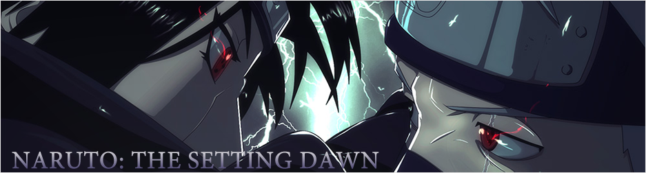
Bloodz has already mentioned your mistakes. So there's no need for my comment but just, here's my opinion:
1st one:
-bad placement of the text
- Never place the text on the render or in the corner of the sig
- The right part of the render is cut off, always hide cut off parts. When there are cut off parts in my sig, I generally smudge them in a way that they won't be visible
- the bg is simple.. as if you've just put it in the sig without your own effort
- in such type of sigs, I would prefer effects other than just making the render blend with the bg
- overall the sig is/looks simple as there aren't much effects in it. But I'm glad that you are back and improvement is seen bro.
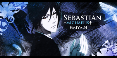
2nd one:
-The sig is messy
- The first one didn't have much effects but this one has unnecessary effects
- some parts are blurred unnecessarily or carelessly
- The Scratch effects do not seem to be showing their reason of presence
- The blurring and scratch effects make the sig low quality
3rd One:
As a banner, it's cool
- Its a bit low quality
- sharpening it will make it look better
4th One:
-render placement could have been a bit better
- effects specially as the ones that you've added in the corner, look a bit odd
- its simple
- effects near the render would have been better instead of effects being put in the corner
- Good text
- simple and decent sig I must say.
You've improved a lot bro. I wish that you'll get better and better in your each upcoming sigs.
KIU.
1st one:
-bad placement of the text
- Never place the text on the render or in the corner of the sig
- The right part of the render is cut off, always hide cut off parts. When there are cut off parts in my sig, I generally smudge them in a way that they won't be visible
- the bg is simple.. as if you've just put it in the sig without your own effort
- in such type of sigs, I would prefer effects other than just making the render blend with the bg
- overall the sig is/looks simple as there aren't much effects in it. But I'm glad that you are back and improvement is seen bro.
2nd one:
-The sig is messy
- The first one didn't have much effects but this one has unnecessary effects
- some parts are blurred unnecessarily or carelessly
- The Scratch effects do not seem to be showing their reason of presence
- The blurring and scratch effects make the sig low quality
3rd One:
As a banner, it's cool
- Its a bit low quality
- sharpening it will make it look better
4th One:
-render placement could have been a bit better
- effects specially as the ones that you've added in the corner, look a bit odd
- its simple
- effects near the render would have been better instead of effects being put in the corner
- Good text
- simple and decent sig I must say.
You've improved a lot bro. I wish that you'll get better and better in your each upcoming sigs.
KIU.

HBK- Hatake Kakashi

- Health : 139
Country :
Posts : 1347
Registration date : 2012-09-06
» My latest AMV
» signatures
» My latest work
» what is the name of naruto shippuden latest theme song?
» HON(Heroes of newerth)Rate my latest video.
» signatures
» My latest work
» what is the name of naruto shippuden latest theme song?
» HON(Heroes of newerth)Rate my latest video.
Page 1 of 1
Permissions in this forum:
You cannot reply to topics in this forum|
|
|